🕶 Happy Data are all Alike
Distributions
 Photo by rawpixel on Unsplash
What graphs will we see today?
Some of the very basic and commonly used plots for data are: - Bar and Column Charts - Histograms and Frequency Distributions - Scatter Plots (if there is more than one quant variable) and - 2D Hexbins Plots and 2D Frequency Distributions (horrors?)
An Example: Bar and Column Charts
Here is a dataset from Jeremy Singer-Vine’s blog, Data Is Plural. This is a list of all books banned in schools across the US.
## # A tibble: 1,586 × 10
##    author  title type_of_ban secondary_author_s illustrator_s translator_s state
##    <chr>   <chr> <chr>       <chr>              <chr>         <chr>        <chr>
##  1 Àbíké-… Ace … Banned fro… <NA>               <NA>          <NA>         Flor…
##  2 Aceved… Clap… Banned fro… <NA>               <NA>          <NA>         Penn…
##  3 Aceved… The … Banned fro… <NA>               <NA>          <NA>         Flor…
##  4 Aceved… The … Banned fro… <NA>               <NA>          <NA>         New …
##  5 Aceved… The … Banned Pen… <NA>               <NA>          <NA>         Texas
##  6 Aceved… The … Banned Pen… <NA>               <NA>          <NA>         Virg…
##  7 Aciman… Call… Banned Pen… <NA>               <NA>          <NA>         Virg…
##  8 Acito,… How … Banned Pen… <NA>               <NA>          <NA>         Flor…
##  9 Adeyoh… 47,0… Banned fro… Adeyoha, Angel     McGillis, Ho… <NA>         Penn…
## 10 Adichi… Half… Banned fro… <NA>               <NA>          <NA>         Mich…
## # ℹ 1,576 more rows
## # ℹ 3 more variables: district <chr>, date_of_challenge_removal <chr>,
## # origin_of_challenge <chr>banned_by_state <- banned %>%
group_by(state) %>%
summarise(total = n())
banned_by_state## # A tibble: 26 × 2
## state total
## <chr> <int>
## 1 Alaska 1
## 2 Arkansas 1
## 3 Florida 204
## 4 Georgia 13
## 5 Illinois 4
## 6 Indiana 18
## 7 Iowa 4
## 8 Kansas 30
## 9 Maryland 1
## 10 Michigan 2
## # ℹ 16 more rowsbanned %>%
group_by(state, type_of_ban) %>%
summarise(count = n()) %>%
slice_max(order_by = count,n = 10) %>%
# pivot_wider(.,id_cols = State,
# names_from = `Type of Ban`,
# values_from = count) %>% janitor::clean_names() %>%
# replace_na(list(banned_from_libraries_and_classrooms = 0,
# banned_from_libraries = 0,
# banned_pending_investigation = 0,
# banned_from_classrooms = 0)) %>%
# mutate(total = sum(across(where(is.integer)))) %>%
ggplot(aes(x = reorder(state, count), y = count, fill = type_of_ban)) + geom_col() + labs(title = "Banned Books by Type across the US") + xlab("State") + coord_flip() + theme_classic()## `summarise()` has grouped output by 'state'. You can override using the
## `.groups` argument.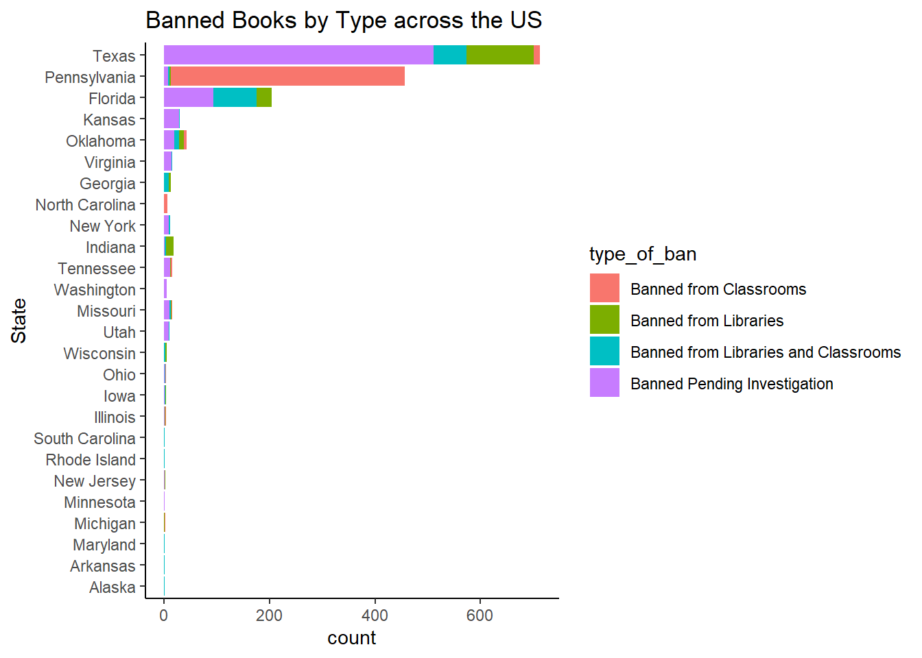
An Example: Histograms and Frequency Distributions
TBD: Example using Flourish
How does this Work?
Histograms are best to show the distribution of raw quantitative data, by displaying the number of values that fall within defined ranges, often called buckets or bins.
Although histograms may look similar to column charts, the two are different. First, histograms show continuous data, and usually you can adjust the bucket ranges to explore frequency patterns. For example, you can shift histogram buckets from 0-1, 1-2, 2-3, etc. to 0-2, 2-4, etc. By contrast, column charts show categorical data, such as the number of apples, bananas, carrots, etc. Second, histograms do not usually show spaces between buckets because these are continuous values, while column charts show spaces to separate each category.
How could you explore?
TBD. Add hexbin plots here
What is the Story here?
TBD
An Example: Frequency Density
How does this work?
Let us listen to the late great Hans Rosling from the Gapminder Project, which aims at telling stories of the world with data, to remove systemic biases about poverty, income and gender related issues.
How many are rich and how many are poor? from Gapminder on Vimeo.
How could you explore?
TBD. Add 2D contour plots and link up to hexbin plots.
What is the Story here?
Your Turn
- Rbnb Price Data on the French Riviera:
- Apartment price vs ground living area:
(Try a Scatter Plot too, since we have two Quant variables)
- Rbnb Price Data on the French Riviera:
- India
- Old Faithful Data
- Income data
- Diamonds Data from R
- calmcode.io dataset
Fun Stuff
- See the scrolly animation for a histogram at this website: Exploring Histograms, an essay by Aran Lunzer and Amelia McNamara https://tinlizzie.org/histograms/?s=09
Arvind V.
My research interests are Complexity Science, Creativity and Innovation, Problem Solving with TRIZ, Literature, Indian Classical Music, and Computing with R.